Trustless Engineering
Product Design
2024
Polishing Transparency: Elevating UX and UI for AI-Powered Blockchain
Skills
UX/UI Design, Product Design
Team
Matt Pfeifer, Peter Mazzocco
Overview
PRISM by Trustless Engineering was built to solve the confusion surrounding cryptocurrency transactions by creating AI agents that translate complex data into user-friendly insights. My role involved enhancing the platform’s user interface for developers and businesses by incorporating some of the minimal branding that existed, while improving user experience behind the scenes. The challenge was to gain attention, attract users, and secure investor interest, despite the preference for aesthetics over functionality.

Project Brief
Trustless Engineering's mission with PRISM was to empower businesses and developers to create AI agents that integrate seamlessly into cryptocurrency platforms, providing transparency and trust within blockchain transactions.
Trustless Engineering developed two core products: PRISM, a B2B platform where developers could build AI agents, and SolanAI (Block Assistant), an AI-powered chatbot designed for consumers.
Initially built in stealth with no users, the platform would later enter public beta with a minimal active user base. The founders prioritized improving the user interface to appeal to investors while overlooking user experience issues. My role as the sole product designer was to elevate the visual design by developing a visual identity for the overall product and incorporate that into the design of PRISM and improve usability to help users navigate the platform more easily. However, being a Product Designer, I believe creating a user interface without a good user experience, is essentially like building a house without a blueprint. I wanted to take it a step further and elevate the user experience when possible.

Research
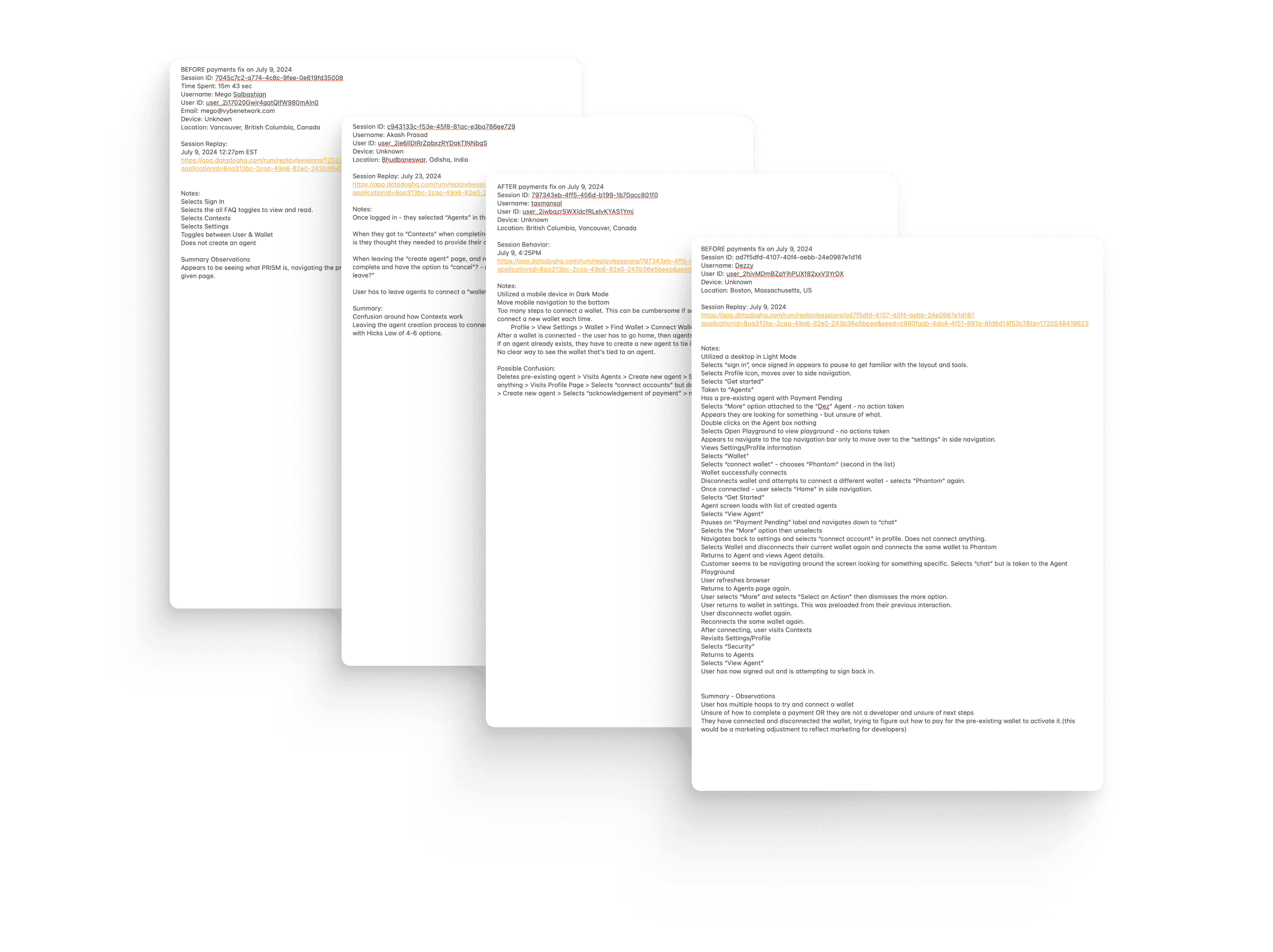
Given the startup's focus on rapid iteration, there was minimal emphasis on traditional user interviews, usability testing, or surveys. The key stakeholders believed user research to be unnecessary, I took the initiative to analyze closed beta user data through Datadog sessions on my accord. This uncovered a major issue: 23% of users abandoned the AI agent creation process due to a disconnect between wallet integration and the creation flow. Users had to leave mid-process to connect their crypto wallet, which forced them to restart the agent creation from scratch, leading to frustration and drop-offs.
Through qualitative research, I found that when users were attempting to create an AI Agent, they would input a name, description, and add a context, when they got to the end of the process, they hesitated, they would then go to their account, disconnect a wallet (if one was already connected), then connect a different wallet. They would then revisit the "Create Agent" process, and have to input all the information again. This behavior is what prompted me to dig deeper into the quantitative data.
Users ultimately just endured the friction as they wanted to continue to use the product, and a few ultimately abandoned the process all together not completing the process to create an AI agent. This would no doubt have a negative impact on growing the user base and indicate to investors that we didn't have an "active" user base. It also didn't really instill confidence in our technology that would lead to adoption as the friction created a poor user experience.
Strategy
User Experience
I developed a strategy to quietly integrate UX improvements while delivering the polished UI the founders wanted. I created a customer journey map to pinpoint the exact points where users were struggling.
In the customer journey flow, majority of the users experiencing this friction, they were abandoning and attempting to connect a wallet at the end of the process rather than the middle or the beginning.
Using methodologies like Fitts' Law, the Goal-Gradient Effect, and chunking, I optimized the flow by introducing a "connect wallet" step at the end of the agent creation process. This change minimized interruptions and kept users engaged throughout the process, all while adhering to the founder's focus on aesthetics.
User Interface
People in the blockchain or cryptocurrency world often refer to themselves as "DeGens" short for "Degenerates". Later we would rebrand it as "Decentralized Generation" in an effort to toss the negative sentiments. This was a way to market that "crypto" was the financial future. A new "generation" with financial confidence, or in other words, a financial revolution. Gathering research for the user interface to help elevate the low-fidelity wireframes into high-fidelity wireframes. I had the one main goal in mind that Trustless Engineering was instilling with the above ideas. The simple goal was:
"Install trust and confidence in blockchain technology"
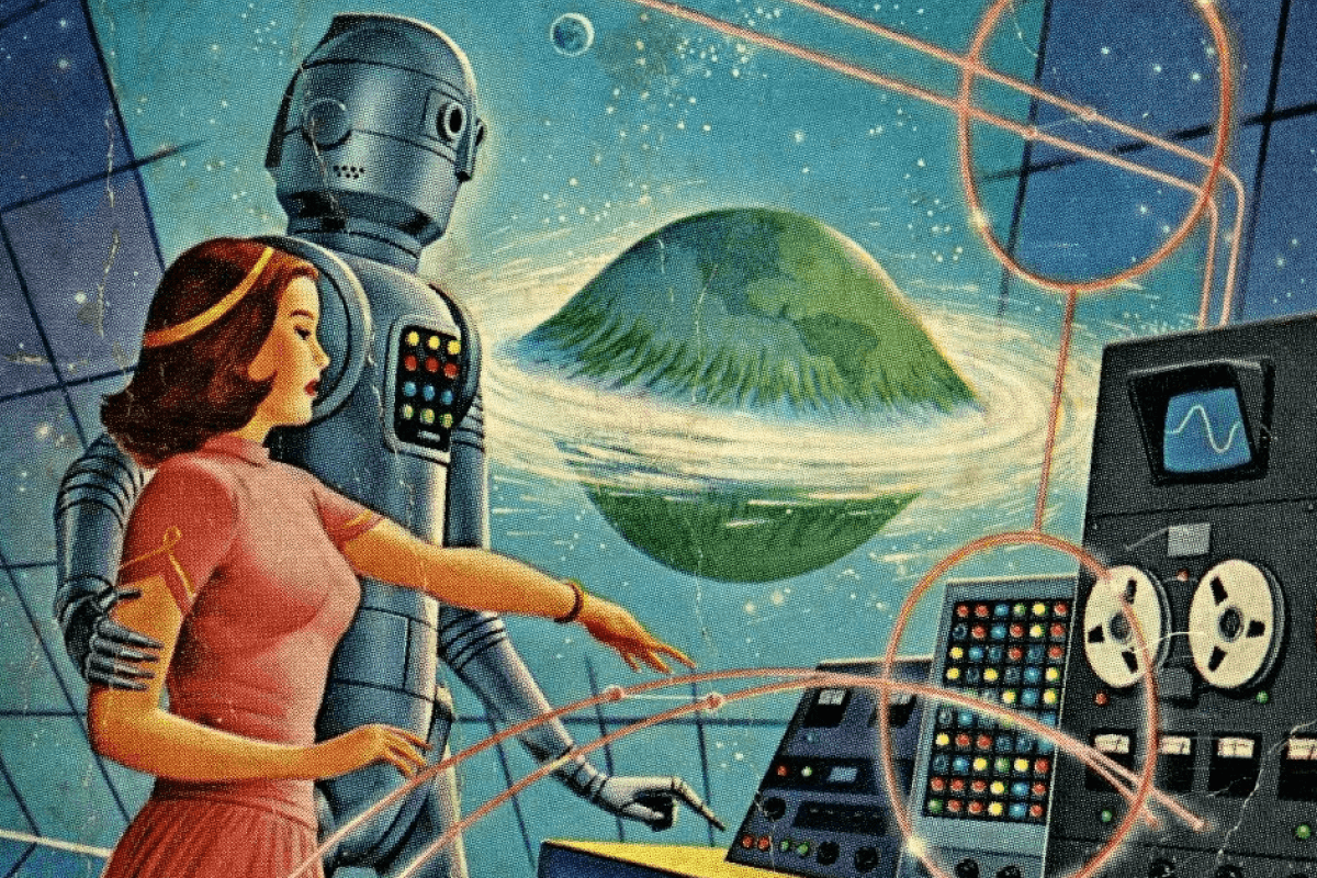
For this, I looked to the past. I revisited various decades and looked to a time when the "American Dream" was promising. Households had confidence in their finances and the overall future financial health. I looked at revolutionary leaders such as Dr. Martin Luther King, and Che. People that wanted to see the world better. I was drawn to the decade where they thrived — the 1950's & 1960's. Looking at this decade, you would also see ads in a household newspaper of illustrated families playing in front of their mid century modern house. I looked at old illustrations of what that decade believed the future would hold.
The word for this illustration style and overall design aesthetic would be described as "Retro Futurism". Think physical buttons, individuals could connect and interact with technology. A skeumorphic design language. Making it a human experience. All this instilled trust, something people understood, and could connect to, associating the past with the present.

Design
The design approach was rooted in the idea of retro-futurism, drawing inspiration from the 1950s and 60s. I initially created design components of skeumorphic buttons, toggles, labels and such. I created a couple of screen mock-ups of this design choice, and presented the design to stakeholders. I didn't want to invest too much time in the idea if it was something that ultimately wasn't going to work. I communicated the idea, the thought that went into it, and how it connected to their long term vision and how it would invoke a sense of trust and stability by recalling a period of economic confidence, which aligned with Trustless Engineering’s goal of making blockchain technology transparent and trustworthy.
While they loved it, they believed in the idea, and understood what I accomplished and agreed. However, due to budget, and time constraints, they ultimately elected to transition to a more traditional "flat design" approach that you see in most modern software design. Skeumorphic design took longer to code and implement. While it aligned with their vision of establishing trust, it didn't align with their plans to iterate quickly and launch quickly.
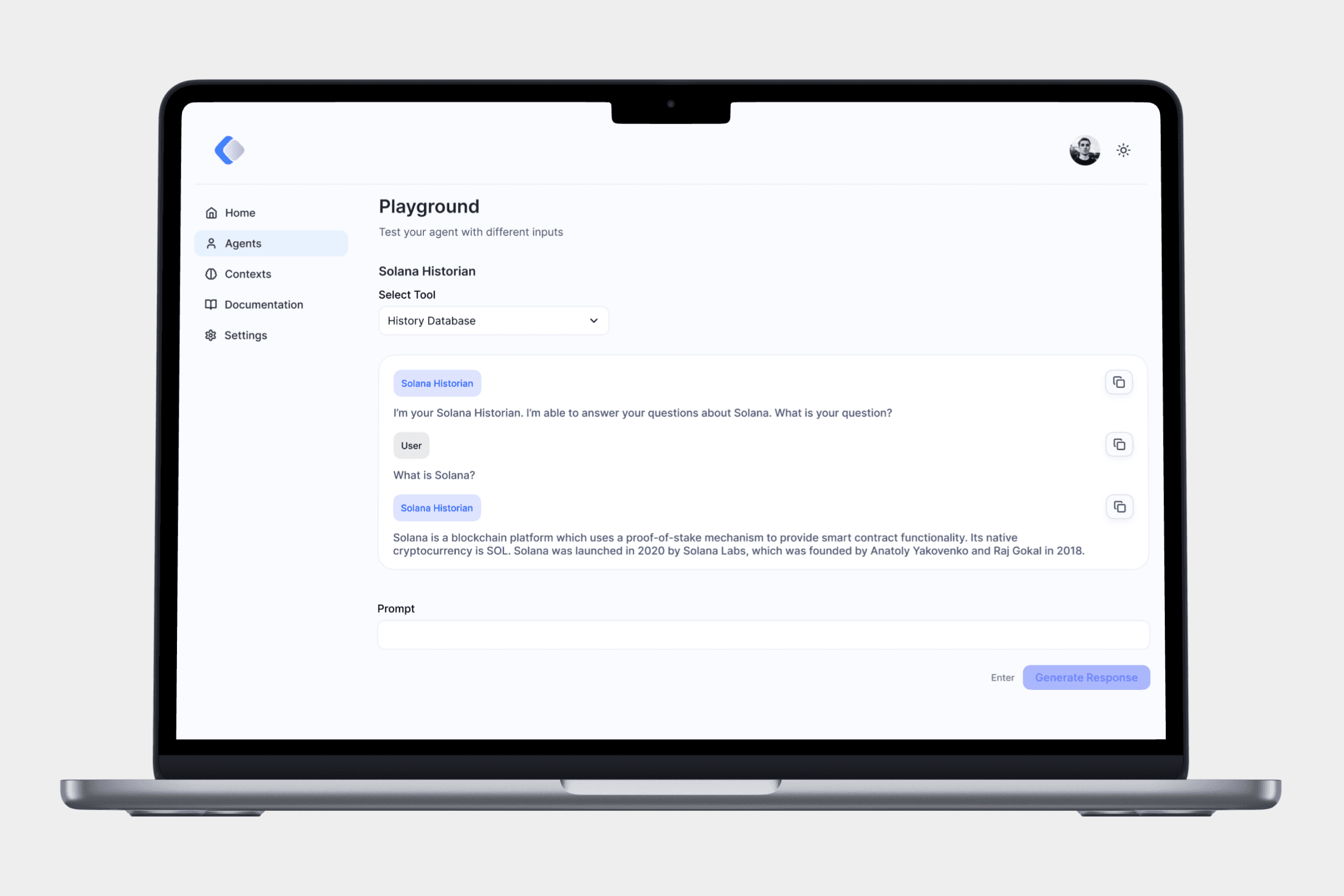
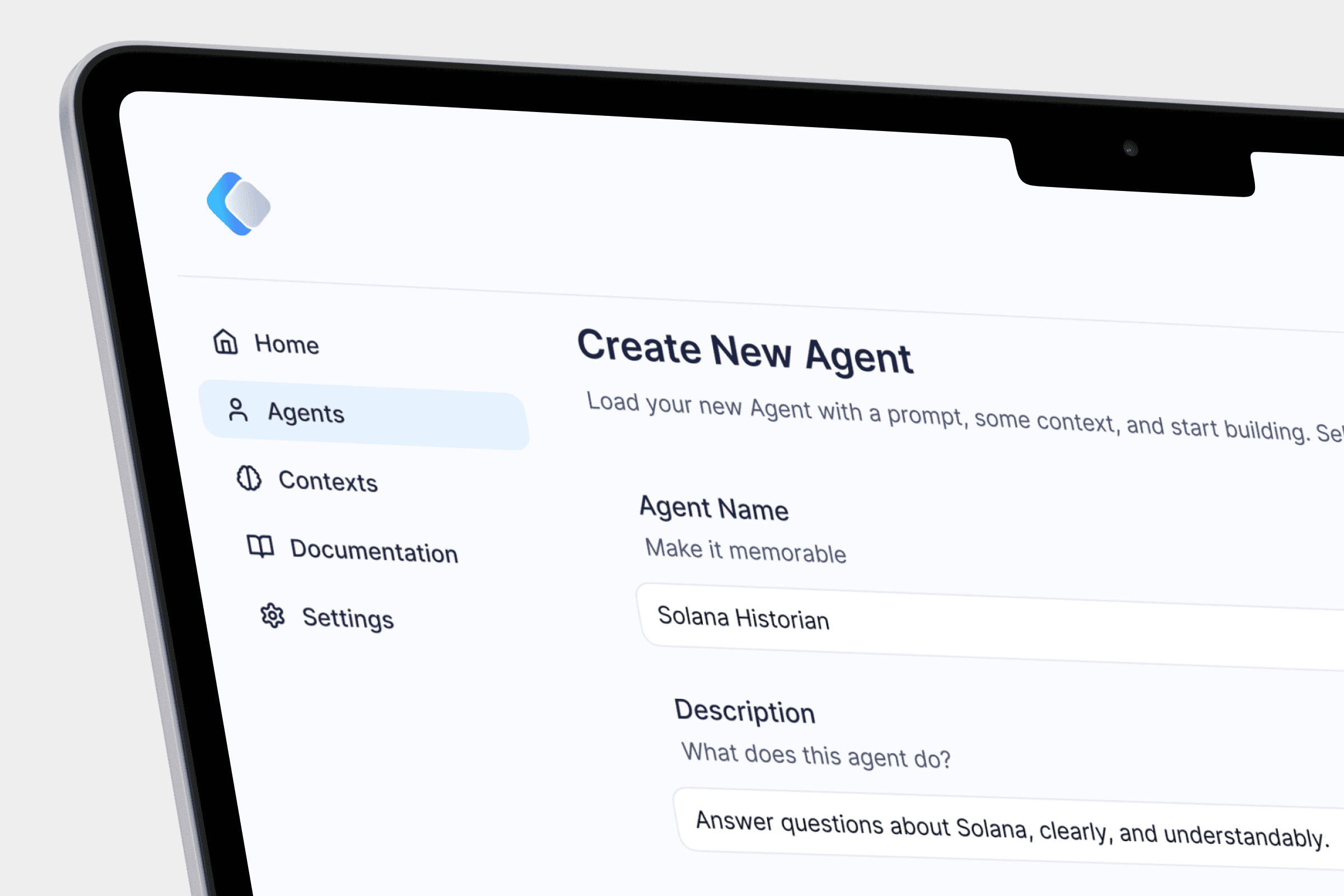
With this feedback, I took the company’s low-fidelity wireframes and transformed them into polished, high-fidelity designs that matched the newly established brand identity in both light mode and dark mode. Utilizing the color palette, and instead of the 3D logos, I utilized the flat, 2D logos. In addition, I developed a small-scale design system with 1,400 elements, including multiple color palettes to ensure scalability in future updates.
I would then implement my adjustments from my recent quantitative and qualitative data found into my UI High-Fidelity mock-ups. When a high-fidelity mockup was completed, I would present the design, along with the UX improvements, and explained the benefits of implementing such change to the overall business goals. Some of the UX adjustments would be added to be corrected, while others would sit in a backlog waiting to be corrected given time and budget constraints depending on the severity and priority of the adjustments. Collaboration with the CEO and front-end developer ensured that the design was implemented according to technical specifications.


Conclusion
The design and UX improvements I implemented for PRISM were well-received by the founders. Over the course of the project, we launched from stealth mode to public beta and gained 400 active users, with positive feedback on both the design and functionality. My work not only contributed to the user interface but also led to me being presented the opportunity to work on SolanAI (Block Assistant), their B2C product. They loved the design language that later involved me working on designs for marketing materials and even designing the visual identity for Trustless Engineering.
This project taught me the value of adaptability. I found ways to use quantitative data to drive UX decisions and highlight user pain points. Sometimes, the best solution is one that balances the practical constraints of the business with the needs of the users. This experience sharpened my ability to work quickly, make data-driven design decisions, and deliver tangible results in a fast-paced startup environment.
While I wasn't able to win over and implement the design language of skeumorphic design to achieve the long term goal of instilling trust in our products, I was able to add an improvement in the user experience. So while in this product I was thinking about the long term solution, I was able to adapt and fit into the short term needs for Trustless Engineering and PRISM.
Trustless Engineering
Product Design
2024
Polishing Transparency: Elevating UX and UI for AI-Powered Blockchain
Skills
UX/UI Design, Product Design
Team
Matt Pfeifer, Peter Mazzocco
Overview
PRISM by Trustless Engineering was built to solve the confusion surrounding cryptocurrency transactions by creating AI agents that translate complex data into user-friendly insights. My role involved enhancing the platform’s user interface for developers and businesses by incorporating some of the minimal branding that existed, while improving user experience behind the scenes. The challenge was to gain attention, attract users, and secure investor interest, despite the preference for aesthetics over functionality.
Project Brief
Trustless Engineering's mission with PRISM was to empower businesses and developers to create AI agents that integrate seamlessly into cryptocurrency platforms, providing transparency and trust within blockchain transactions.
Trustless Engineering developed two core products: PRISM, a B2B platform where developers could build AI agents, and SolanAI (Block Assistant), an AI-powered chatbot designed for consumers.
Initially built in stealth with no users, the platform would later enter public beta with a minimal active user base. The founders prioritized improving the user interface to appeal to investors while overlooking user experience issues. My role as the sole product designer was to elevate the visual design by developing a visual identity for the overall product and incorporate that into the design of PRISM and improve usability to help users navigate the platform more easily. However, being a Product Designer, I believe creating a user interface without a good user experience, is essentially like building a house without a blueprint. I wanted to take it a step further and elevate the user experience when possible.
Research
Given the startup's focus on rapid iteration, there was minimal emphasis on traditional user interviews, usability testing, or surveys. The key stakeholders believed user research to be unnecessary, I took the initiative to analyze closed beta user data through Datadog sessions on my accord. This uncovered a major issue: 23% of users abandoned the AI agent creation process due to a disconnect between wallet integration and the creation flow. Users had to leave mid-process to connect their crypto wallet, which forced them to restart the agent creation from scratch, leading to frustration and drop-offs.
Through qualitative research, I found that when users were attempting to create an AI Agent, they would input a name, description, and add a context, when they got to the end of the process, they hesitated, they would then go to their account, disconnect a wallet (if one was already connected), then connect a different wallet. They would then revisit the "Create Agent" process, and have to input all the information again. This behavior is what prompted me to dig deeper into the quantitative data.
Users ultimately just endured the friction as they wanted to continue to use the product, and a few ultimately abandoned the process all together not completing the process to create an AI agent. This would no doubt have a negative impact on growing the user base and indicate to investors that we didn't have an "active" user base. It also didn't really instill confidence in our technology that would lead to adoption as the friction created a poor user experience.
Strategy
User Experience
I developed a strategy to quietly integrate UX improvements while delivering the polished UI the founders wanted. I created a customer journey map to pinpoint the exact points where users were struggling.
In the customer journey flow, majority of the users experiencing this friction, they were abandoning and attempting to connect a wallet at the end of the process rather than the middle or the beginning.
Using methodologies like Fitts' Law, the Goal-Gradient Effect, and chunking, I optimized the flow by introducing a "connect wallet" step at the end of the agent creation process. This change minimized interruptions and kept users engaged throughout the process, all while adhering to the founder's focus on aesthetics.
User Interface
People in the blockchain or cryptocurrency world often refer to themselves as "DeGens" short for "Degenerates". Later we would rebrand it as "Decentralized Generation" in an effort to toss the negative sentiments. This was a way to market that "crypto" was the financial future. A new "generation" with financial confidence, or in other words, a financial revolution. Gathering research for the user interface to help elevate the low-fidelity wireframes into high-fidelity wireframes. I had the one main goal in mind that Trustless Engineering was instilling with the above ideas. The simple goal was:
"Install trust and confidence in blockchain technology"
For this, I looked to the past. I revisited various decades and looked to a time when the "American Dream" was promising. Households had confidence in their finances and the overall future financial health. I looked at revolutionary leaders such as Dr. Martin Luther King, and Che. People that wanted to see the world better. I was drawn to the decade where they thrived — the 1950's & 1960's. Looking at this decade, you would also see ads in a household newspaper of illustrated families playing in front of their mid century modern house. I looked at old illustrations of what that decade believed the future would hold.
The word for this illustration style and overall design aesthetic would be described as "Retro Futurism". Think physical buttons, individuals could connect and interact with technology. A skeumorphic design language. Making it a human experience. All this instilled trust, something people understood, and could connect to, associating the past with the present.
Design
The design approach was rooted in the idea of retro-futurism, drawing inspiration from the 1950s and 60s. I initially created design components of skeumorphic buttons, toggles, labels and such. I created a couple of screen mock-ups of this design choice, and presented the design to stakeholders. I didn't want to invest too much time in the idea if it was something that ultimately wasn't going to work. I communicated the idea, the thought that went into it, and how it connected to their long term vision and how it would invoke a sense of trust and stability by recalling a period of economic confidence, which aligned with Trustless Engineering’s goal of making blockchain technology transparent and trustworthy.
While they loved it, they believed in the idea, and understood what I accomplished and agreed. However, due to budget, and time constraints, they ultimately elected to transition to a more traditional "flat design" approach that you see in most modern software design. Skeumorphic design took longer to code and implement. While it aligned with their vision of establishing trust, it didn't align with their plans to iterate quickly and launch quickly.
With this feedback, I took the company’s low-fidelity wireframes and transformed them into polished, high-fidelity designs that matched the newly established brand identity in both light mode and dark mode. Utilizing the color palette, and instead of the 3D logos, I utilized the flat, 2D logos. In addition, I developed a small-scale design system with 1,400 elements, including multiple color palettes to ensure scalability in future updates.
I would then implement my adjustments from my recent quantitative and qualitative data found into my UI High-Fidelity mock-ups. When a high-fidelity mockup was completed, I would present the design, along with the UX improvements, and explained the benefits of implementing such change to the overall business goals. Some of the UX adjustments would be added to be corrected, while others would sit in a backlog waiting to be corrected given time and budget constraints depending on the severity and priority of the adjustments. Collaboration with the CEO and front-end developer ensured that the design was implemented according to technical specifications.
Conclusion
The design and UX improvements I implemented for PRISM were well-received by the founders. Over the course of the project, we launched from stealth mode to public beta and gained 400 active users, with positive feedback on both the design and functionality. My work not only contributed to the user interface but also led to me being presented the opportunity to work on SolanAI (Block Assistant), their B2C product. They loved the design language that later involved me working on designs for marketing materials and even designing the visual identity for Trustless Engineering.
This project taught me the value of adaptability. I found ways to use quantitative data to drive UX decisions and highlight user pain points. Sometimes, the best solution is one that balances the practical constraints of the business with the needs of the users. This experience sharpened my ability to work quickly, make data-driven design decisions, and deliver tangible results in a fast-paced startup environment.
While I wasn't able to win over and implement the design language of skeumorphic design to achieve the long term goal of instilling trust in our products, I was able to add an improvement in the user experience. So while in this product I was thinking about the long term solution, I was able to adapt and fit into the short term needs for Trustless Engineering and PRISM.
Scroll to Top
Other projects

UX/UI Design, Branding, Framer Design
Elevating a Building Information Modeling Company’s Digital Presence
UX/UI Design, Branding, Framer Design
Elevating a Building Information Modeling Company’s Digital Presence

UX/UI Design, Product Design
Designing Trust in Decentralized Finance
UX/UI Design, Product Design