Empire BIM
Framer
2023
Elevating a Building Information Modeling Company’s Digital Presence
Skills
UX/UI Design, Branding, Framer Design
Team
Nick Souza
Overview
Empire BIM, a building information modeling (BIM) company, A newly launched company needed to overhaul its digital presence to attract new clients, increase lead generation, and elevate its brand to appear more polished and professional. In order to launch their company quickly they initially used an outdated, template-based website, they struggled to instill confidence in their services and stand out within the construction industry. I was hired to design a new responsive website that modernized their online presence across desktop, tablet, and mobile. However, I discovered that they would need to develop an entire brand identity from scratch. This project presented an opportunity to create a cohesive identity for a company that had little direction in how it presented itself to the world.
I approached this project holistically, focusing not just on visual design but also on creating a consistent brand identity, implementing user experience (UX) principles, and developing a lead-generation funnel that would drive business growth.

Project Brief
When I was brought in, Empire BIM had an outdated website built on a GoDaddy template, which had been created in a short period without much thought given to design, user experience, or brand consistency. The company’s primary goal was to generate more leads and convey a higher level of professionalism to attract better contracts with project managers, construction companies, and other businesses in the construction industry.
Empire BIM’s website lacked any sense of structure or flow. There was no clear call to action (CTA), branding was inconsistent, and the site felt disjointed and outdated. Their existing logo was all sourced from a low-cost provider, with no further direction and did not reflect the level of quality or experience the company wanted to project.
My task was to develop a brand identity that encompassed their logo, color palette, typography, and visual language, and then translate this into a website that not only looked professional but also enhanced user experience and increased lead generation.
Original Site:
Research
My first challenge was understanding an industry that I had no prior experience in. Empire BIM’s founders had over 30 years of combined experience in construction, so I leaned on their deep knowledge of the industry to understand the fundamentals of BIM and its importance to construction professionals. From our discussions, I learned that most professionals in this space were already familiar with BIM, so there wasn’t a need for a website that focused heavily on educating users about BIM itself. Instead, we needed to highlight what made Empire BIM unique, showcasing their expertise and services in a way that would resonate with potential clients.
In addition to learning about the company from its founders, I conducted a competitive analysis of similar companies in the industry, such as Indovance and Precision Point. What I discovered was that many construction-related websites were outdated and visually unappealing, often using basic templates or legacy designs that did not reflect the modern tech-forward nature of BIM technology. Even the companies that seemed more established were using simplistic designs that failed to inspire confidence. I found this to be a recurring problem in the construction industry, where technology plays a vital role in operations but is often poorly represented in the branding and website design.
As part of my competitive analysis, I also reviewed websites in adjacent industries to gather insight into how modern tech companies, such as Autodesk (which develops software used in the BIM industry), approached branding and design. These sites featured clean, minimalistic layouts, clear CTAs, and vibrant color palettes that communicated a sense of modernity and innovation.

Strategy
With this research in hand, I formulated a design strategy focused on two main objectives:
Building a consistent and modern brand identity: Empire BIM had no defined brand identity, so I started by creating a cohesive visual language that would establish them as a professional company. This involved modernizing their logo, creating a sophisticated color palette, and selecting typography that would reflect their tech-forward approach while remaining approachable and professional.
Designing a website optimized for lead generation: The website needed to do more than just look good. It had to function as a tool for attracting and converting leads. This meant designing with user experience at the forefront, implementing a clear CTA strategy, and ensuring that the website structure guided users seamlessly toward contacting the company.
Branding Development
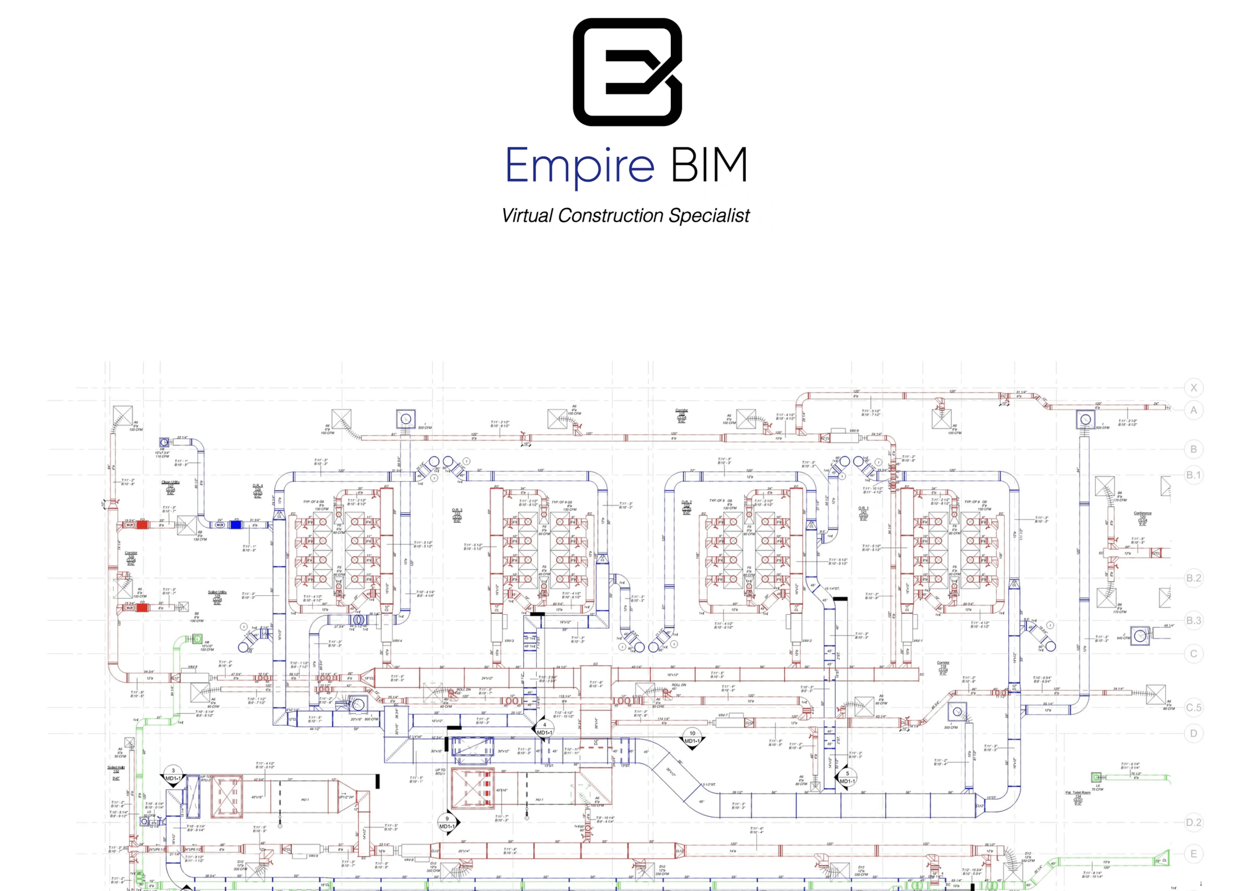
Establishing a clear brand identity was the first and most crucial step. Empire BIM’s Identity was minimal. Essentially what boiled down to a single logo, and a really dark navy blue color of said logo. I worked closely with the owners to create a vision for their brand that would be easily recognizable, professional, and cohesive across all touchpoints.
I moved away from the typical construction industry color schemes (usually yellow, red, or black) and introduced a lighter, more modern blue, similar to the shades used by tech giants like Facebook and Twitter. This gave the brand a fresh and youthful look, reflecting its modern, technology-driven approach. The typography was also critical to this transformation. We opted for the "Inter" font, a clean and modern sans-serif typeface, which had the clarity of Helvetica but with a more contemporary feel. Together, these changes established a strong, recognizable visual identity that could be applied not only to the website but also to other future marketing efforts.
Lead Generation Funnel
The website’s primary goal was to generate leads, and I structured the design to guide users naturally toward conversion. Drawing from my background in UX, I incorporated principles such as the Goal Gradient Effect and Selective Attention to guide users’ to key CTAs. Each page of the website was designed with intention, ensuring that users would always have a clear path toward contacting the company or learning more about their services.
I also set up Google Analytics and integrated contact forms to track user behavior and capture lead information. The CTA placement was consistent throughout the site, creating multiple touchpoints for users to reach out to Empire BIM. This strategy was essential for increasing lead generation and ensuring the company could grow its client base.
Design
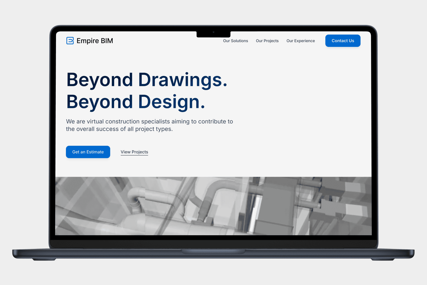
Once the branding was finalized, I moved on to designing the website. Using Figma for initial wireframing and prototyping, I created a clean, modern layout that emphasized Empire BIM’s professionalism and expertise. I wanted to ensure that the website would not only be visually appealing but also functional, easy to navigate, and intuitive for users.
Aesthetic and Usability
Given the outdated nature of most construction websites, I wanted to differentiate Empire BIM by introducing more modern design elements like animations and responsive layouts. The color palette I created (featuring a modern blue) and the clean sans-serif typography (Inter) gave the site a tech-forward aesthetic that set them apart from their competitors.
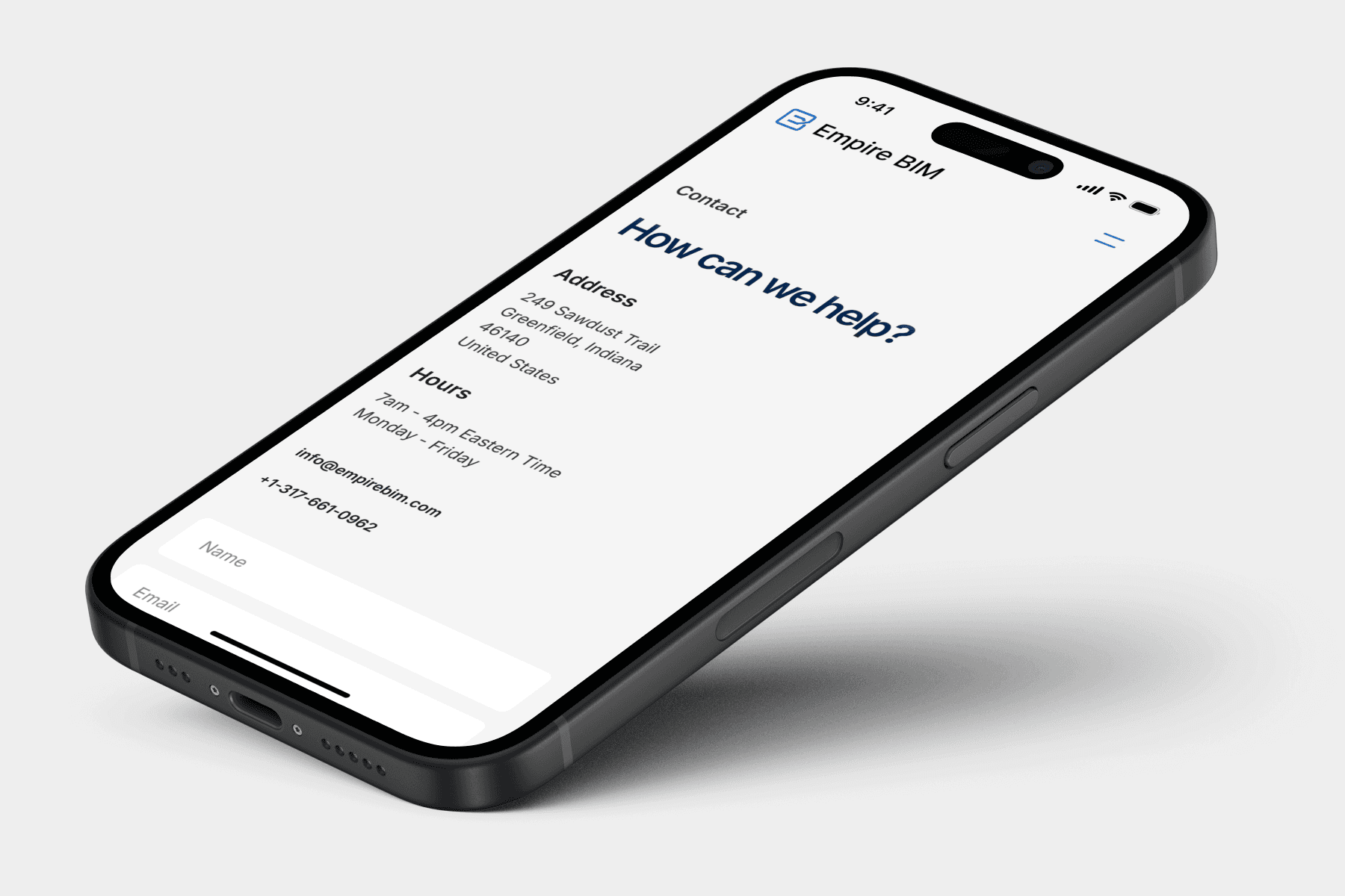
However, one challenge arose after the website was launched. When Empire BIM sent the site to friends and family for feedback, we discovered that the "Projects" section, which featured horizontal scrolling animations on desktop, did not display correctly on mobile devices with accessibility settings enabled. This was a critical issue, as a significant portion of users would likely access the site via mobile devices. To address this, I redesigned the "Projects" section for mobile, converting the horizontal scroll to a vertical one, which aligned better with natural user behaviors on mobile devices. This ensured that the user experience was seamless across all platforms, maintaining the professional and polished feel of the desktop site while optimizing for mobile interaction.


Conclusion
The project for Empire BIM was not just about designing a website; it was about transforming the way the company presented itself to the world. Through open dialogue and collaboration with the owners, I was able to provide them with a website that not only looked great but also functioned as a tool for generating leads and driving business growth. I educated the founders on the value of consistent branding and how design can be leveraged for long-term success.
By focusing on both the big picture (branding, lead generation) and the small details (responsive design, user experience), I delivered a solution that set Empire BIM up for future success. Their new brand identity, combined with a modern and functional website, helped them stand out in a crowded industry and instill confidence in potential clients. This all lead to Empire BIM being in contention to provide Building Information Modeling (BIM) to the the National Football Leagues Cleveland Browns stadium in Cleveland, Ohio.
In the end, this project was a learning experience for both the company and me. They gained a deeper understanding of the power of design, and I sharpened my skills in designing for an industry I had no prior experience in. Together, we created something that elevated their business and set them on a path for growth.
Empire BIM
Framer
2023
Elevating a Building Information Modeling Company’s Digital Presence
Skills
UX/UI Design, Branding, Framer Design
Team
Nick Souza
Overview
Empire BIM, a building information modeling (BIM) company, A newly launched company needed to overhaul its digital presence to attract new clients, increase lead generation, and elevate its brand to appear more polished and professional. In order to launch their company quickly they initially used an outdated, template-based website, they struggled to instill confidence in their services and stand out within the construction industry. I was hired to design a new responsive website that modernized their online presence across desktop, tablet, and mobile. However, I discovered that they would need to develop an entire brand identity from scratch. This project presented an opportunity to create a cohesive identity for a company that had little direction in how it presented itself to the world.
I approached this project holistically, focusing not just on visual design but also on creating a consistent brand identity, implementing user experience (UX) principles, and developing a lead-generation funnel that would drive business growth.
Project Brief
When I was brought in, Empire BIM had an outdated website built on a GoDaddy template, which had been created in a short period without much thought given to design, user experience, or brand consistency. The company’s primary goal was to generate more leads and convey a higher level of professionalism to attract better contracts with project managers, construction companies, and other businesses in the construction industry.
Empire BIM’s website lacked any sense of structure or flow. There was no clear call to action (CTA), branding was inconsistent, and the site felt disjointed and outdated. Their existing logo was all sourced from a low-cost provider, with no further direction and did not reflect the level of quality or experience the company wanted to project.
My task was to develop a brand identity that encompassed their logo, color palette, typography, and visual language, and then translate this into a website that not only looked professional but also enhanced user experience and increased lead generation.
Original Site:
Research
My first challenge was understanding an industry that I had no prior experience in. Empire BIM’s founders had over 30 years of combined experience in construction, so I leaned on their deep knowledge of the industry to understand the fundamentals of BIM and its importance to construction professionals. From our discussions, I learned that most professionals in this space were already familiar with BIM, so there wasn’t a need for a website that focused heavily on educating users about BIM itself. Instead, we needed to highlight what made Empire BIM unique, showcasing their expertise and services in a way that would resonate with potential clients.
In addition to learning about the company from its founders, I conducted a competitive analysis of similar companies in the industry, such as Indovance and Precision Point. What I discovered was that many construction-related websites were outdated and visually unappealing, often using basic templates or legacy designs that did not reflect the modern tech-forward nature of BIM technology. Even the companies that seemed more established were using simplistic designs that failed to inspire confidence. I found this to be a recurring problem in the construction industry, where technology plays a vital role in operations but is often poorly represented in the branding and website design.
As part of my competitive analysis, I also reviewed websites in adjacent industries to gather insight into how modern tech companies, such as Autodesk (which develops software used in the BIM industry), approached branding and design. These sites featured clean, minimalistic layouts, clear CTAs, and vibrant color palettes that communicated a sense of modernity and innovation.
Strategy
With this research in hand, I formulated a design strategy focused on two main objectives:
Building a consistent and modern brand identity: Empire BIM had no defined brand identity, so I started by creating a cohesive visual language that would establish them as a professional company. This involved modernizing their logo, creating a sophisticated color palette, and selecting typography that would reflect their tech-forward approach while remaining approachable and professional.
Designing a website optimized for lead generation: The website needed to do more than just look good. It had to function as a tool for attracting and converting leads. This meant designing with user experience at the forefront, implementing a clear CTA strategy, and ensuring that the website structure guided users seamlessly toward contacting the company.
Branding Development
Establishing a clear brand identity was the first and most crucial step. Empire BIM’s Identity was minimal. Essentially what boiled down to a single logo, and a really dark navy blue color of said logo. I worked closely with the owners to create a vision for their brand that would be easily recognizable, professional, and cohesive across all touchpoints.
I moved away from the typical construction industry color schemes (usually yellow, red, or black) and introduced a lighter, more modern blue, similar to the shades used by tech giants like Facebook and Twitter. This gave the brand a fresh and youthful look, reflecting its modern, technology-driven approach. The typography was also critical to this transformation. We opted for the "Inter" font, a clean and modern sans-serif typeface, which had the clarity of Helvetica but with a more contemporary feel. Together, these changes established a strong, recognizable visual identity that could be applied not only to the website but also to other future marketing efforts.
Lead Generation Funnel
The website’s primary goal was to generate leads, and I structured the design to guide users naturally toward conversion. Drawing from my background in UX, I incorporated principles such as the Goal Gradient Effect and Selective Attention to guide users’ to key CTAs. Each page of the website was designed with intention, ensuring that users would always have a clear path toward contacting the company or learning more about their services.
I also set up Google Analytics and integrated contact forms to track user behavior and capture lead information. The CTA placement was consistent throughout the site, creating multiple touchpoints for users to reach out to Empire BIM. This strategy was essential for increasing lead generation and ensuring the company could grow its client base.
Design
Once the branding was finalized, I moved on to designing the website. Using Figma for initial wireframing and prototyping, I created a clean, modern layout that emphasized Empire BIM’s professionalism and expertise. I wanted to ensure that the website would not only be visually appealing but also functional, easy to navigate, and intuitive for users.
Aesthetic and Usability
Given the outdated nature of most construction websites, I wanted to differentiate Empire BIM by introducing more modern design elements like animations and responsive layouts. The color palette I created (featuring a modern blue) and the clean sans-serif typography (Inter) gave the site a tech-forward aesthetic that set them apart from their competitors.
However, one challenge arose after the website was launched. When Empire BIM sent the site to friends and family for feedback, we discovered that the "Projects" section, which featured horizontal scrolling animations on desktop, did not display correctly on mobile devices with accessibility settings enabled. This was a critical issue, as a significant portion of users would likely access the site via mobile devices. To address this, I redesigned the "Projects" section for mobile, converting the horizontal scroll to a vertical one, which aligned better with natural user behaviors on mobile devices. This ensured that the user experience was seamless across all platforms, maintaining the professional and polished feel of the desktop site while optimizing for mobile interaction.
Conclusion
The project for Empire BIM was not just about designing a website; it was about transforming the way the company presented itself to the world. Through open dialogue and collaboration with the owners, I was able to provide them with a website that not only looked great but also functioned as a tool for generating leads and driving business growth. I educated the founders on the value of consistent branding and how design can be leveraged for long-term success.
By focusing on both the big picture (branding, lead generation) and the small details (responsive design, user experience), I delivered a solution that set Empire BIM up for future success. Their new brand identity, combined with a modern and functional website, helped them stand out in a crowded industry and instill confidence in potential clients. This all lead to Empire BIM being in contention to provide Building Information Modeling (BIM) to the the National Football Leagues Cleveland Browns stadium in Cleveland, Ohio.
In the end, this project was a learning experience for both the company and me. They gained a deeper understanding of the power of design, and I sharpened my skills in designing for an industry I had no prior experience in. Together, we created something that elevated their business and set them on a path for growth.
Scroll to Top
Other projects

UX/UI Design, Product Design
Designing Trust in Decentralized Finance
UX/UI Design, Product Design
Designing Trust in Decentralized Finance

UX/UI Design, Product Design
Polishing Transparency: Elevating UX and UI for AI-Powered Blockchain
UX/UI Design, Product Design